14 May 2020
Synergy Learning: new look, same values

Jonny McAlister
Head of Sales & Marketing

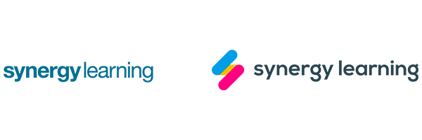
A fresh look for the Synergy Learning brand.
Today we’re launching our new website, which features our new logo and branding.
We’ve been really eager to share with you the results of some work we’ve been doing behind the scenes to refresh our look and we can finally do it!
We love the new brand, which really encapsulates what we’re about. We hope you like it, too.
Why the change?
If the new brand encapsulates what we’re about, the old brand and website no longer did. They looked confined and boxy (totally at odds with our fluid and bespoke approach to projects).
They didn’t speak to our values. You couldn’t really learn anything about us from looking at the logo.
And for a team that prides itself on delivering learning platforms that ‘WOW’ visually, our own branding didn’t.
What’s changed?
We wanted our brand to become the visual representation of the experience you have when you work with us. We’re not an out-of-the-box solution. We tailor our work to get the best results for how you do things. Here’s how we went about evolving our brand to capture that.
Colours
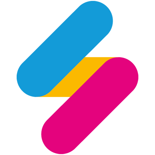
We’ve updated our colour palette to make the brand more vibrant and better reflect our approach to projects. Blue is for productivity, solidarity, stability and sincerity. The pink represents creativity, insightfulness and fun. Yellow points to communication, harmony, confidence and joy.
Brandmark
For the first time, we have a visual representation of our brand that can stand alone from the logo. It depicts you and us as two parallels (blue and pink), working alongside each other and travelling in the same direction. We’re brought together by the yellow of communication and harmony. This signifies the journey we take you on during a project, guided by the values we mentioned in relation to the colours.
Typeface
Our new logo typeface features rounder letters and softer edges, which represents the fluidity and freedom we bring to projects. It also gives us a fresher look. The dual-tone text of the old logo is gone, so ‘Synergy Learning’ is now visually represented in a more stable, sincere and confident way.
Website
By incorporating all of the things detailed above, a new design and improved user experience, we can now get information to you more easily through our website. It looks and feels more fluid, which brings you closer to our ways of doing things.
New Look, Same Values
While we’re changing our look, we still work to the same mission and values as an organisation. We’ll continue to create incredible learning experiences using technologies that deliver tangible, compelling results.
And we’ll continue to strive to be the world leader in results-driven learning technologies that Excite, Engage and Empower.