
13 May 2026
Data storytelling for L&D: How to communicate compliance learning data

Natalie Ann Holborow
Content Manager
When presenting compliance data to your stakeholders, the data should tell a story that feels reassuring: completion rates are high, assessment scores are comfortably above the benchmark and satisfaction scores suggest that employees are engaging with the compliance training provided.
However, as you hand over reams of tables and complicated charts, you’re met with confusion. This is where data storytelling helps to connect learning data to real-world impact though the right narrative.
So, how do you tell a compelling story using compliance data from your learning management system?
What is data storytelling?
Before exploring how to apply it, let’s clearly define what data storytelling means in practice (particularly in the context of L&D).
Data storytelling is the use of data, visualisations and narrative to communicate insights in a way that is easy to understand. As an L&D professional, this is particularly important because it underlines a shift away from reporting isolated metrics and towards creating a cohesive narrative that connects learning activity with behavioural and organisational outcomes.
Why does data storytelling matter in learning?
For learning and development teams, compliance responsibilities go far beyond delivering training modules and tracking completion metrics. There’s also an increasing expectation to demonstrate how learning interventions influence behaviour, reduce risk and contribute to wider organisational goals. But, when learning management system data is presented in isolation (e.g. percentages, dashboards or spreadsheets), it often lacks the context needed to make these connections meaningful.
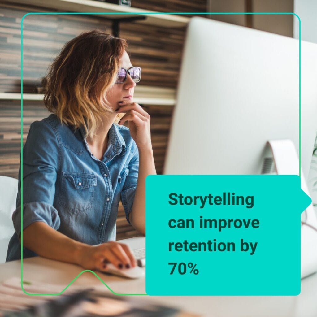
Research consistently shows that the way information is communicated has a significant effect on how it is understood and retained. The London School of Business found that people have different levels of information retention based on how that information is given to them. When they hear statistics alone, they retain only 5% to 10% of what they hear.
However, when stories are used to convey that same information, retention jumps to an impressive 65% to 70%. There’s a critical opportunity for L&D here, highlighting that the challenge isn’t an absence of data, but the lack of a compelling narrative that translates this data into insight and action.
How to structure a story around learning impact
To communicate the impact of compliance training effectively, you might want to structure your data within a narrative framework that mirrors how people naturally process information, moving from context to insight and ultimately to action.
1. Outline the challenge
To get started, we recommend clearly outlining the challenge or risk that prompted the learning intervention in the first place (e.g. recurring audit findings or inconsistent decision-making in high-risk situations) before introducing the training itself as a targeted response designed to address those issues.
2. Demonstrate change over time
Next, think about your evidence. Rather than just reporting on activity, you want the data to demonstrate change over time. For example, you might want to show improvements in scenario-based assessments, reductions in specific types of incidents or increased confidence in handling compliance-related situations.
3. Articulate the broader impact of compliance training
Finally, the story should then articulate the broader impact of these changes. You can link them to tangible outcomes, such as:
- ✅ Reduced regulatory exposure
- ✅ Improvements to organisational culture
- ✅ Improved operational consistency
This ensures the data is not only informative, but is also meaningful to what your stakeholders most care about.

Strengthening the narrative with visuals
Storytelling will give you the narrative structure, but the right visuals will give you the clarity you need to bring that story to life in a way stakeholders can understand. It’s important to choose the right visual for the story you’re trying to tell with the data. The visual should ideally support a single, clear message rather than causing overwhelm.
A team of neuroscientists from MIT discovered that the human brain can process entire images that are seen for as little as 13 milliseconds. This means there’s huge potential for well-designed visuals to reinforce key insights and make the data more accessible. Be mindful in choosing visual formats that align with the story you’re trying to tell – ask yourself: “Does this visual help to create greater understanding of what I’m trying to prove?”
Let’s take a look at some example visuals you could use to illustrate different types of data.
Trend lines: Showing change over time
Rather than presenting static data in tables, which can be hard to visualise, trend lines enable you to illustrate how metrics evolve over time. This makes it far easier to connect learning interventions with measurable outcomes over a defined period.
For example, a trend line showing compliance training completion rates alongside key milestones (such as the launch of a new module or a targeted communication campaign) helps stakeholders see clearly where participation improved, plus when and why that improvement occurred.
Heat maps: Highlighting risk areas
When the goal is to draw attention to areas of heightened risk, heat maps provide an immediate and intuitive way to illustrate these areas without requiring a detailed interpretation of numerical data.
By using colour gradients to represent the levels of risk across departments, regions or compliance topics, you can quickly show stakeholders the areas where attention is urgently needed.
For example, rather than listing assessment scores by department, a heat map can help you visually highlight where knowledge gaps are most pronounced. This helps your leaders to prioritise interventions more effectively, so they understand where action should be taken and why it’s important.

Comparative charts: Demonstrating impact
Comparative charts are useful when you want to show the difference a learning intervention has made in a way that is tangible for stakeholders. By presenting solid before-and-after data (e.g. assessment results prior to training compared with those collected afterwards, or incident rates before and following a compliance initiative), you can demonstrate visually a clear link between learning and outcomes.
This side-by-side comparison will strengthen your narrative by making improvement visible and measurable, showing how your learning intervention has contributed to meaningful change.
Modern learning management systems such as Moodle LMS and Totara provide you with powerful visual dashboards to communicate the data you need effectively. For example, in the latest version of Totara, a visual compliance block provides an at-a-glance dashboard for you and your stakeholders to gauge progress without getting overwhelmed by data.
Adapting the story for different stakeholders
Different stakeholders will bring different priorities, perspectives and expectations to the conversation. Perhaps your senior leaders are most focused on risk, performance and strategic alignment, whereas your compliance teams might be more concerned with regulatory exposure and policy adherence. Your managers, on the other hand, might come to the meeting looking for practical insights to help them support their teams.
Because of this, you need to be prepared to adapt your narrative depending on your audience. Jim Stikeleather, in an article in Harvard Business Review, said that “visualisation in its educational or confirmational role is really a dynamic form of persuasion”. For this reason, you should think carefully about what story your audience is most interested in and how your narrative (and visuals) can persuade them to accept what you say.
Ready to start telling your story with learning data?
Ultimately, data storytelling in L&D is designed to help you move beyond reporting for its own sake and towards influencing decisions, perceptions and behaviours at every level of the organisation.
When compliance training data is presented as a coherent and compelling story, connecting learning activity to behavioural change and business outcomes. It’s a powerful tool to have in your L&D toolkit if you want to demonstrate value and secure ongoing investment in learning.
Want to see how you can get the best out of your LMS data? Get in touch, and we’ll be happy to talk through your needs.